


Color is just as important in the digital world as it is in the real world. Many times we do not even realize the importance that this has in our day-to-day life, the decisions we make or the state of mind in which we find ourselves.
Color theory
What is color really? Although we are used to seeing the different colors, we know their names and properties, colors are simply the way light is reflected. Our eye interprets the different wavelengths of light and its reflection in the object and in this way we obtain the color of the object even though it is not colored. This is how computer or television screens work, for example.
Color properties
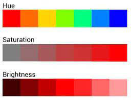
We divide the color into three properties based on its representation: hue, saturation, and brightness. The tone is what gives the hue to the colors, if we see it bluish, orange, greenish or yellowish, for example. Saturation is the intensity of this hue, from vivid to gray, as gray represents lack of intensity. The brightness, in turn, or luminosity, tells us if it is darker or lighter and therefore goes from black to white.
The RGB wheel
Los colores luz se representan muchas veces en la forma de un círculo cromático o una rueda donde los primarios son el rojo, el verde y el azul. De allí el nombre: R-red, G-green, B-blue, en inglés. Son los colores que estamos acostumbrados a ver en todos los dispositivos y el mundo digital en general, y por lo tanto, muy importantes para la marca DESSYGN.
Light colors are often represented in the form of a chromatic wheel where the primary are red, green, and blue. Hence the name: R-red, G-green, B-blue. These are the colors that we are used to seeing on all devices and the digital world in general, and therefore very important for the DESSYGN brand.

The colors that are formed in the intersections are the mixture of red and blue, blue and green or green and red and form the secondary colors. The sum of all colors, and logically the representation of the total presence of light is the color white.
The CMYK model
Another way of naming colors is following the CMYK or Cyan, Magenta, Yellow, blacK model. In pigment colors, the tactic is that color is actually subtracted from white, instead of mixing the colors to obtain it, as was the case with RGB, and thus the different shades are obtained: greater quantity, less luminosity. Since it is very difficult to obtain pure black, and very expensive, because a lot of ink would be used, K (black) is added and thus we also obtain the two types of cartridges that are used today in printing: black and tri-color.

Now that we know the basics of color theory, let’s finally see why the DESSYGN logo is the way it is. If you haven’t already noticed. Spoiler alert: it’s not just what you think, there’s an extra from Malaga.
The DESSYGN case
In the section on my services I already explain what is behind each color of my logo. But why these colors exactly? The answer is very simple, but it involves several levels of symbology.

If you stop to see the scheme of my services, or take a look at my Instagram posts, you will see that the intersections made up of the Branding, Advertising and Copy services are not only smaller but actually symbolize the fusion of the circles next to them. In the case of branding, it is the fusion of marketing with design; advertising is born when we mix linguistic techniques with the creativity of design, etc. So, does all this have a relation to colors?
We already know that the DESSYGN logo icon looks a lot like the RGB holy trinity, but… not quite. The symbology of the logo is that the services I offer are mainly for the digital world and therefore the RGB color mode will be used, although there are some services that do involve the CMYK mode, mainly in advertising.
Okay but… why so little brightness? (45% to be exact)
As you can see in my projects section, and especially Dessy Vassileva Ltd., the logo for my company used this same reddish-violet color, so I decided to keep this essence of my old image and develop the new one from there. The other colors maintain the same balance in terms of brightness and saturation, to form the triary colors together with their center, white.
Besides, I was fascinated by how without realizing it I had included colors very similar to those of the Malaga flag, made up of violet and green.

Malaga, although not my mother city, occupies a large part of my heart and the place that helped me in every way to fulfill my dream and be able to truly work on my passion.
I wait for you in Malaga to talk about your brand and grow together. And if not in Malaga, then in the digital world.
See you soon!